Monthly Archives: December 2012

Entering 2013 and Beyond

Energy growth in 2013 will be tightly coupled to economic growth and that will remain true for at least a decade. Supply fades as a factor while getting the correct fuel portfolio balance will be a key to quality of life worldwide for the foreseeable future.

We have once again returned to a world where energy discussions are dominated by demand. It’s a very different world than that where all the focus is on supply.

As has been a recurrent theme on this blog, I need to note that many have not recognized this sea change. Organizations ranging from the U.S. Department of Energy and the International Energy Agency to the World Bank and the International Monetary Fund are still basing their forecasts on potential supply bottlenecks rather than watching how demand is calling forth new supplies from all over the world.

The stories on the DOE’s EIA webpage tell part of the story–from their perspective, trying to give their ‘customers’ (us) what they want. A story of supply. ‘The Availability of Petroleum and Petroleum Products From C0untries Other Than Iran.’ ‘Crude Oil Inventories.’ ‘Weekly Coal Production.’

This focus on supply has led these agencies to underestimate the growth of energy for the future. Regular readers will see me banging the drum again on this.

Energy supply has changed. China is currently building 308 hydroelectric facilities–large dams to generate electricity–in 70 countries worldwide.

Growth in U.S. energy has reached the top of the hill and now has surpassed the very modest growth in energy consumption in this country.

The world has 66 nuclear power plants under construction, 26 in China alone.

While the U.S. plays in its own sandbox with fracked natural gas, Australia, the Ukraine, Israel and plans in Brazil are changing everybody’s ideas about electricity generation and even automotive fuel.

Renewable energy continues to grow, providing almost 17% of all energy used in 2012.

Basically, folks, increased demand from the developing world called forth successful efforts to increase supply.

This is great news–the developing countries will have access to the energy they need to develop up to and perhaps beyond the living standards of the rich world. I am ecstatic.

This is terrifying news, as well. Despite the growth in non-emissive energy sources, the primary sources for fuel remain coal and petroleum. The annual growth rate in coal consumption since 1999 is 4.4%.

saupload_developing_world_coal_use_1989_20081

This weblog is titled 3,000 Quads because unconstrained growth will lead to that level of energy being consumed by 2075, far more than the supply-oriented organizations are projecting now.


Starting a New Blog About Climate Change

Well, I am going to split my blogging time. I find that I want to write more about climate change, but I don’t want to do it here. I want to keep this blog’s focus on energy consumption, so I have started a new weblog called The Lukewarmer’s Way. Feel free to drop by and say hi.

Dangers of a Data Monoculture

For almost a year I have been trying to alert readers to the strong possibility that  organizations charged with estimating future energy usage are consistently underestimating totals. I think the source of their error lies in miscalculating the take-up of energy in the developing world, compounded by their ignoring current latent demand and, perhaps most importantly, their stubborn refusal  to acknowledge that energy demand is not very elastic. It’s the last bill to go unpaid, so to speak.

Because of these errors, I think they have underestimated short term energy demand (through 2030) by a third. And I’ve spent a lot of time here showing why and discussing the possible consequences.

How do organizations like the U.S. Department of Energy’s Energy Information Administration, the International Energy Administration, World Resources Institute, the IMF, the World Bank and companies like Exxon, BP and others who produce energy estimates get tied up in knots about things like this?

I think the answer, implied by the title of this post, is fairly easy to illustrate and explains a lot of problems with forecasting both within and outside the energy sector.

Take the DOE’s EIA. They spent a lot of time and energy developing a model of future growth of energy. I’m sure they were diligent and thought hard about it. (I think the defect is that it’s based on energy supplies, not demand, and that it thinks that people will quit using energy if it gets expensive.)

But the problem with their recent forecasts lies in their model-dependent analysis. After spending all that time and energy building their model, obviously they’re going to use it a lot. Sadly, it seems that they’ve tunneled their vision onto the model to the exclusion of a lot of data in the real world. (This is then exacerbated by the confirmation bias of looking at friendly analysis of the same sources by other organizations and feeling relieved when they arrive at similar results.)

Model dependency crops up in other areas as well. Economics, climate change–both are examples where tunnel vision is hurting analysis. We saw in my recent post that nobody had published a simple mash-up of CO2 emissions and recent temperature trends and my modest posting of the two together got quite a reaction. In finance, many of the great and the good seem determined to ignore Nassim Nicholas Taleb in charting paths to economic recovery, with one side making the (almost forgiveable) error of wanting to adopt one-half of the Keynesian prescription (deficit spending for investment in the face of a liquidity trap) without making a good faith commitment to practicing the other half (creating a budget surplus) when times are good.

The other side (the ECB and U.S. Republicans) are making the far more grievous error of looking at deficit numbers in isolation, thinking that the gross totals and their increase are reasons to abandon social programs and reduce debt at any cost. It makes me wonder if any of them have ever had a mortgage on a home. The cost to borrow money for governments with floating currencies has never been lower and the U.S. and the UK in particular should be spending their way to recovery. It will be tougher for the Eurozone countries, but they need to find a way.

In climate change discussions both activists and skeptics have found a comfort zone of data they are willing to use to advance their arguments. Activists like models, as real world observations are not exact enough to help them make their case. Skeptics like statistical rules and laws, which highlight the deficiencies and call arguments into question. Neither side has spent enough time examining the sources of data used by the other team. Activists still, in the waning days of 2012, show a surprising naivete and ignorance about statistics, while skeptics stubbornly refuse to acknowledge that models can be useful, if users keep their limitations in mind and a copy of The Black Swan on their desks.

CO2_Temp-Plot

The other fields that suffer from the same tunnel vision–healthcare, gun control, genetically modified organisms and their utility/safety or lack thereof–tend to comprise, with those examined above, most of the things we fight about.

I don’t consider that surprising. I don’t consider it unintentional. I do consider it as potentially fatal to the cause of solving any of the real problems that confront modern society.

Recapitulation and Rededication

My last post got linked, republished and talked about, apparently. We got a lot of traffic as a result.

I suppose I should be tempted to sink back into the morass of the climate wars and go for the big traffic that might justify my adding ads to the site. For now I’m going to resist. There are too many places where people can go to talk about climate change, and too few where energy is the focus. And I think this might be the only one with a micro focus on energy consumption.

Energy consumption. The worry of mine that gave birth to this weblog is that we are underestimating future energy consumption and as a result are sleepwalking into a world where coal becomes (again) the default fuel used to power the rise of the developing world. We’re not doing the infrastructure planning that will allow nuclear, hydroelectric, wind/solar/biofuels and even natural gas to take some of the burden off of old king coal.

Specifically, in the near term I project that the world will use 947 quads in 2035, far more than the 712 estimated by the DOE EIA, the IEA and the U.N. I also project it will only get worse after 2035, leading to an incredible 3,000 quads every year by 2075.

Of course this will have an effect on climate–even if atmospheric sensitivity is as low as I think (and hope), the brute force effect of the emissions associated with that much consumption of coal will impact our climate.

I’ve tried to show it and discuss it. So far, more than 22,000 visits to this blog have maybe convinced a few hundred people that I have a case. I hope so.

On to today’s topic. The Department of Energy’s Energy Information Administration has published their Early Release of the U.S. Annual Energy Outlook for 2013.

U.S. Energy Production 1980 2040

Some key points:

  • Domestic production of crude oil is increasing and is expected to continue to increase, reaching 7.5 million barrels per day by 2019
  • Our consumption of natural gas is also expected to increase, from 6.8 trillion cubic feet per year in 2011 to 7.8 trillion cubic feet in 2019
  • They have increased their projections of generation from solar and wind, from 13% of the total in 2011 to 16% in 2040. The EIA is not so optimistic about advanced biofuels, lowering the predicted output from all biomass from their 2012 prediction of 5.4 quads to 4.2 quads by 2035
  • With improved efficiency of energy use and a shift away from the most carbon-intensive fuels, U.S. energy-related carbon dioxide
    (CO2) emissions remain more than 5 percent below their 2005 level through 2040
  • They have upped their prediction of GDP growth per year, from 2.5% to 2.6% CAGR through 2040.
  • As for the reason I was so eager to look at the report… they obviously don’t agree with me. They predict that total energy consumption will rise by a total of 7% by 2035, from 98 quads in 2011 to 104 quads in 2035 and then by 6% to 2040 to a total of 108 quads. (I think it will be higher.)
  • Their justification still centers around their belief that energy intensity will decline as total U.S. population increases by 29 percent from 2011 to 2040, but energy use grows by only 10 percent, with energy use per capita declining by 15 percent from 2011 to 2040. I want some of what they’re smoking

Overall, I still think they’re looking too much at the inputs to their models–pricing and supply constraints, availability etc., instead of accepting that the demand for fuel is not very price sensitive and will be driven by population and GDP growth. Energy efficiency will surely help us out. But we’ve picked a lot of the low hanging fruit from that tree, and future progress in energy efficiency will be progressively more difficult.

It is when you combine the analysis of different data sources…

I apologize once again for the usual reasons. First, for the length of time since last I posted–we’ve moved and that was more disruptive this time than the 44 other moves I’ve made as an adult.

Second, for returning to direct discussion of climate change, something that is closely connected to energy consumption but so controversial as to impede rather than inspire rational discussion. But as I don’t see this elsewhere I want to write this here.

The physics behind the theory of global warming are solid. CO2 is a greenhouse gas, we’re emitting industrial levels of it, a significant portion remains in the atmosphere for a fairly long time. This retards the cooling of the Earth and temperatures warm as a result.

One of the few non-controversial datasets in climate change is the Keeling curve, the graph of the concentrations of CO2 in the atmosphere reproduced here:

Keeling

We see concentrations rising steadily from 315 parts per million in 1960 to 395 ppm last year. It’s close to 400 ppm now.

Human emissions of CO2 caused by burning of fossil fuels and production of cement have risen similarly:

Global_Carbon_Emission_by_Type


Emissions have climbed at an even higher rate than concentrations.

And the third data source to look at (for simplicity’s sake–we could actually look at dozens of data sources) is temperature changes. This chart shows the global average temperature change from a ‘normal’ 30-year range from 1950-1980. It comes from the Goddard Institute for Space Studies, led by scientist James Hansen.

GISS global temperature anomalies

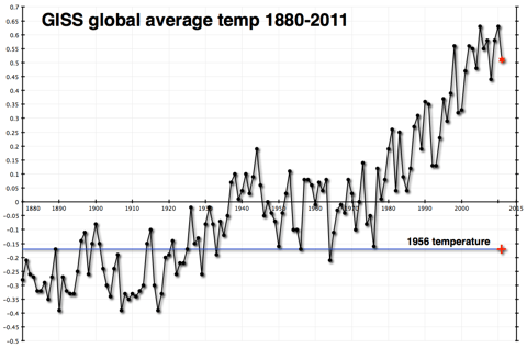
This shows a fairly constant rise in temperatures since 1978.

Once again, you don’t have to be a climate scientist to think that there seems to be a connection. The physical theory published first by Svante Arrhenius over 100 years ago and elaborated on by a century’s worth of scientists has observational evidence that tends to confirm it. I certainly believe in it.

In fact, I believe that global temperatures will probably rise by about 2 degrees Celsius over the course of this century. The difference in estimated temperature rises from different sources almost always comes from the differences in estimated atmospheric sensitivity to concentrations of CO2 in the atmosphere. Having extra CO2 in the atmosphere warms the atmosphere, which is presumed to produce more water vapor, which is also a greenhouse gas and would contribute more warming than the CO2 by itself. How much extra warming would ensue is pretty much the heart and soul of the debate over global warming.

Those who think that there isn’t much of an additional effect (that sensitivity of the atmosphere is low) have been chuckling very publicly because temperatures haven’t risen very much (if at all) since the big El Nino year of 1998. This is not hugely surprising, as the shape of the data is uneven, a sawtooth with ups and downs that can last a decade or longer. But it is happening at an inconvenient time politically for those who are worried that sensitivity is high. They are trying to get the world to prepare for warming of 4.5C or higher, without much success.

Here’s what temperatures look like more recently.

hadcrut-3-global-mean-1998-to-2012

By itself, this chart doesn’t explain very much. As I said, it is not uncommon or unexpected for the temperature record to have flat or declining periods that last a decade or more.

However, I have a problem. The Carbon Dioxide Information Analysis Center (CDIAC) has estimates of how much CO2 humans have emitted since 1750. (Confusingly, they convert the CO2 to tons of carbon with a fixed formula.) That chart is the first one way up there at the top of the post. It rises dramatically

But looking at the data global.1751_2009 (3), one thing jumps out at me. CDIAC writes “Since 1751 approximately 356 billion metric tonnes of carbon have been released to the atmosphere from the consumption of fossil fuels and cement production.” And they helpfully provide an Excel spreadsheet showing their estimates by year.

And almost one-third of that number, 110 billion metric tonnes, have occurred since that time in 1998 when temperatures reached their temporary plateau.

1998 6644
1999 6611
2000 6766
2001 6929
2002 6998
2003 7421
2004 7812
2005 8106
2006 8372
2007 8572
2008 8769
2009 8738

Because heat moves somewhat sluggishly through the earth’s oceans, and because there is a lag factor in other earth systems, we do not expect a hair-trigger reaction to increases in CO2 emissions and concentrations.

But one-third of all human emissions of CO2 have occurred since 1998. And temperatures haven’t budged as a result.

This does not ‘disprove’ global warming–at all. I still believe that temperatures will climb this century, mostly as a result of the brute force effect of the 3,000 quads of energy we will burn every year starting in 2075–the reason I started this weblog.

However it makes it exceedingly difficult to use the past 15 years as evidence of a very high sensitivity of the atmosphere to CO2 concentrations. And it makes me feel more comfortable about my ‘lukewarm’ estimate of 2C temperature rises as opposed to the more alarming 4.5C rises put forward by some of those who are most active in the movement to reduce emissions drastically.

And it makes me wonder about why people don’t include relevant data when they discuss these issues. Is it really that politically incorrect to show real data, even if that data doesn’t advance your case?