Before we start hectoring China to start reducing energy consumption (watch it peak about 2050, though), we should take a look at our own.
The United States uses about 100 quads per year right now. Unless you’ve been reading this blog or have related interests, that figure probably doesn’t mean very much to you. Here’s what a quad really is. 100 quads is really a lot of energy–about 20% of world consumption by about 6% of the world’s population.
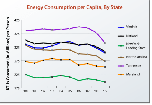
Another way to look at energy consumption is to look at how much energy is consumed per person per year. In the United States we are using about 310 million British Thermal Units per person per year. (What’s a British Thermal Unit? See here.)
That’s a lot of energy, but not as much as people burn in Canada (427 mbtus per capita) or Iceland (560 mbtus per capita), but as we have more people, that’s scant comfort. If we reduced our average consumption by 20%, to about 250 mbtus per person, we’d be using energy at the same rate as the Germans (245 mbtus per capita).
Well, would that involve major sacrifice? We might ask Maryland, which used 250 mbtus per capita in 2009. Or New York, which used 196 mbtus in the same year. They’re actually fairly sophisticated, high infrastructure places–kinda like Germany. The trick is for places like Tennessee (331 mbtus per capita) to catch up with the leaders. Here’s how it looks on a map.
We do this all the time in other fields. We establish a benchmark (250 mbtus per person), provide assistance to those in the back of the pack, reward achievement and penalize those who don’t make an effort.
And it works wherever it’s tried (and done well).


If you compare the energy.gov and population maps there appears to be a loose correlation between the population density (high infrastructure?) and BTU’s per person. This linkage may even follow through to Canada which generally has a thin strip of relatively dense population along the border with large sparsely poulated areas to the north.
If this is the case then surely the solution you propose is merely peanalising those who live away from the main centres of population.
And Tennessee – your graph shows that the big reduction already happening without adding a carrot and stick approach – could this just be advancing technology in action?
Hi FrankSW,
Yeah, that kind of looks like it’s worth exploring. But what about Texas? And you’re certainly right about Tennessee making good progress… But, umm, what about Texas?
Hi All-I am waiting with you.Even thugoh I know Mike is safe I fee the stress level rising.I have waited and worried more times than I can remember.Those 100 milers are killers!But, be assurred and take the advice that no news is good news.Unpleasant news travels very fast. I’m saying my prayers for everyone on the mountain and all of you. Sandy
Tom, Are your source numbers sliceable either by county or by industry type? You might find that the densities of detailed population or heavy industry centers were more important. Louisiana looked odd to me, but perhaps that could be accounted for by the amount of petrochemical industry there (or something like that).