This is in the first of a series of posts looking at the 5 major consumers of energy and emitters of greenhouse gases. The purpose is to investigate if these countries have available options to them that will allow them to meet their energy needs and at the same time lessen the impact of their energy consumption on the environment.
This post is about India. India will become the world’s most populous country by 2028, according to the BBC. According to PWC, their economy will grow from $3.375 trillion to $43.2 trillion by 2050. Although China gets a lot of attention regarding energy, pollution and emissions, India is the linchpin country for sustainable energy futures.
This analysis shows that India can potentially shift its fuel portfolio slightly in a ‘greener’ direction, but meeting the economic needs of its people will almost certainly mean continued use of large quantities of coal. The west should focus our assistance on making their coal plants cleaner and helping eliminate entirely the use of firewood and dung among the rural poor, either by rapid extension of the electricity grid or by installation of solar powered ‘micro-grids.’ Consideration should also be given to assisting India’s nuclear and hydro-electric programs.
Background
India consumed 32 quads last year. It is projected by the DOE EPA to increase its consumption to 42.6 quads by 2040. My far more dramatic projection shows India’s energy consumption growing to almost 100 quads by that time. (My model is more focused on population growth and increasing GDP, while the EIA is more focused on supply constraints. If you like, I look at demand while the EIA looks at supply.)
This is how they got their energy in 2012, according to the EIA:

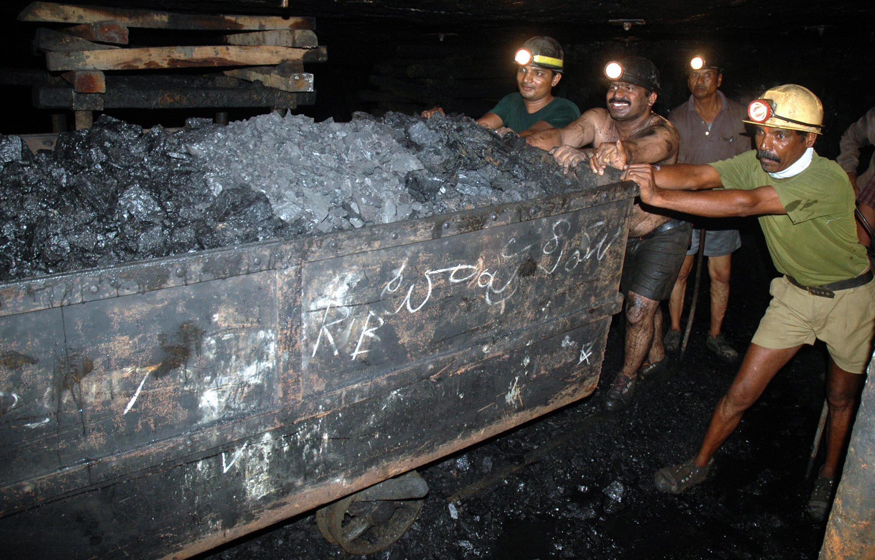
India has huge reserves of coal, but they are not good at getting it out of the ground, so they are the world’s third largest importer of coal, most of it coming from Indonesia. India also imports a lot of oil, 42% of its annual consumption, most of it from the Saudis. India started importing natural gas in 2004, mostly from Qatar.
Only 2% of India’s electricity comes from nuclear, and only (I say only because the Himalayas are right there…) 16% from hydroelectricity. 59% of India’s electricity comes from burning coal.
India’s Options
Although India is home to more of the world’s poor than any other country (about 400 million people living on less than $1.25 a day), it is developing quickly. Because so much of its energy infrastructure is crude at best, India actually has more options than some countries that have already sunk costs in plant that maybe they regret today.
India has a large amount of latent demand for energy. about 167 million rural households don’t have access to electricity. Because India has to dig itself out of a big hole, it needs to think more ambitiously about its supply.
Nuclear
India has 21 reactors today providing 1% of India’s energy. It is planning to spend $1 trillion over the course of the next 35 years, to 40 reactors by 2040 and 100 by 2050. That can be expressed technically as ‘a good beginning.’ Those 100 future reactors may provide about 2% of India’s energy needs by the time they are brought online, assuming they’re all built. Very recent agreements with the United States about insurance for private companies and loosening restrictions on fuel supplies may trigger an acceleration of nuclear.
Hydropower
India is the 7th largest producer of hydropower in the world, but it could do so much more. As noted above, it only produced 3.5% of the country’s energy last year and only 17% of the nation’s electricity. It currently has a capacity of 39,788 MW at 60% load. However, studies have identified about 100,000 MW of potential hydropower installations, and another 100,000 MW of potential pumped storage. India is not blind to the potential of hydro and has about 50 projects under construction right now.
Wind and Solar
India installed 2,084 MW in wind turbine capacity in 2014, bringing its total to 22,465 MW. It expects that to increase by 10% in 2015. It is an asterisk in the energy totals of the country and will probably remain so. Wind strength is irregular throughout the country, either too little or too much too often.
Almost all of India receives enough direct solar to make solar panels an effective solution. About the same amount of solar was added to total capacity last year as wind–2,600 MW. It is still an asterisk. However, because of solar’s potential to provide micro grid solutions to rural villages, it punches above its weight at the moment, bringing electricity to people who otherwise would not have it.
Natural Gas
India has proven reserves of 1.24 trillion cubic meters. It brought 40.3 billion cm out of the ground in 2012, which provided 7% of the country’s power. Offshore gas (and oil) exploration may lift their reserve totals dramatically.
Oil
As India is a major importer of oil and as oil is expensive in India even following recent price drops, oil accounts for only 22% of energy consumption. Another brake on use of oil is poverty–not many Indians have cars. This is expected to increase as India develops further.
India has about 5.7 billion barrels in proven reserves, about 4 years worth of current consumption. It is accelerating exploration of off shore sites, but is a major importer of oil.
Coal
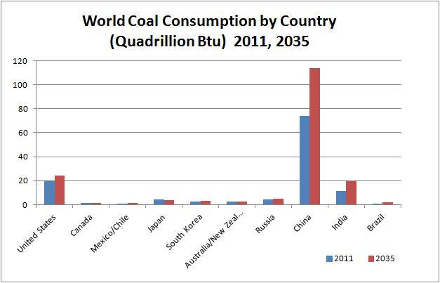
India has proven reserves of coal amounting to 301 billion tons. 54% of their installed electricity base is coal-fueled and 67% of planned addition to generating capacity is also to be coal-fired. Coal amounted to 44% of all energy consumption last year. Current plans foresee little change in coal’s percentage, which is bad news for India as their total energy consumption increases.
Biomass
Burning dung and firewood provides 22% of India’s energy. We’re not talking about sophisticated biofuels or wood pellet plants. It’s dung and firewood. Realistically speaking, if India set as its major goal the substitution of anything–coal, oil, anything–for this biomass, it would be a major victory for India’s energy future and the health of its population.
India’s Energy Future
Citigroup predicted in 2011 that India would become the world’s largest economy by 2050. As China’s population dips and America continues to grow at developed world rates, this may happen (although there’s quite a bit of optimism needed for such an assumption).
India is scrambling for energy, as both rich and poor want more than is available now. This has led to a schizophrenic pattern of importing oil and coal while investing in nuclear, wind and solar. The current administration under Modi sounds tech-friendly, but almost his first act as prime minister was to work towards increasing production of domestic coal.
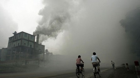
Air pollution in India is bad–westerners don’t hear much about it because it’s worse in China. According to the NY Times, “Last month, the Yale Environmental Performance Index ranked India 174th out of 178 countries on air pollution. According to India’s Central Pollution Control Board, in 2010, particulate matter in the air of 180 Indian cities was six times higher than World Health Organization standards. More people die of asthma in India than anywhere else in the world. Indoor air pollution, mostly from cooking fires, and outdoor air pollution are the third and fifth leading causes of death in India.”
If they depend on coal for future growth in energy, the pollution will get much worse. If car ownership grows as expected, vehicle pollution will be a new and fairly dramatic source of pollution.
But India does have alternatives. Accelerated take-up of hydropower, nuclear and solar is actually feasible in this sunny country with a wealth of engineering talent and access to capital both on the private market and from multi-national institutions.
- Expand the grid as rapidly as possible. Even if plants are coal-fired, they are cleaner than home use of coal, dung, firewood and kerosene.
- Encourage use of electric scooters in areas with reliable electricity supply–there are electric three wheelers that can carry more people and groceries.
- Increase investment in nuclear, solar and hydropower. Drop local content regulations, especially for solar
- Orient all future wind projects to work in tandem with hydroelectric installations to provide pumped storage.
- Ask for help in building clean coal plants, getting solar up and running and getting the most efficient turbines for hydro facilities
Enthusiastic adoption of each of these measures will not solve all of India’s problems. They will struggle. They will burn more coal than we in the west wish they would. But it will make the next 60 years ‘survivable’ in the sense that they may avoid large scale fatalities and morbidity due to conventional pollution. It will also help bend the curve of CO2 emissions down from BAU projections.
If India does move in the direction I have suggested, they will be able to hold their heads high and say that their development path is arguably more constructive, even more civilized, than that used by western countries a century or two ago.


Ah, Victor?
Victor, did you ever talk to a reference librarian? The questions you ask are good — but asking them of the wind, or typing them into the computer, does not get you the help for which you appear to be crying out.
Talk to someone near you who understands statistics.
Please. Otherwise you may — as appears so far — mistakenly convince yourself that ignoramus necessarily means ignorabimus.
At Azimuth, the topic that Jan Galkowski points to, ends with: